AI-Powered Career Platform for Interview Preparation

Responsibility:
Time & Status:
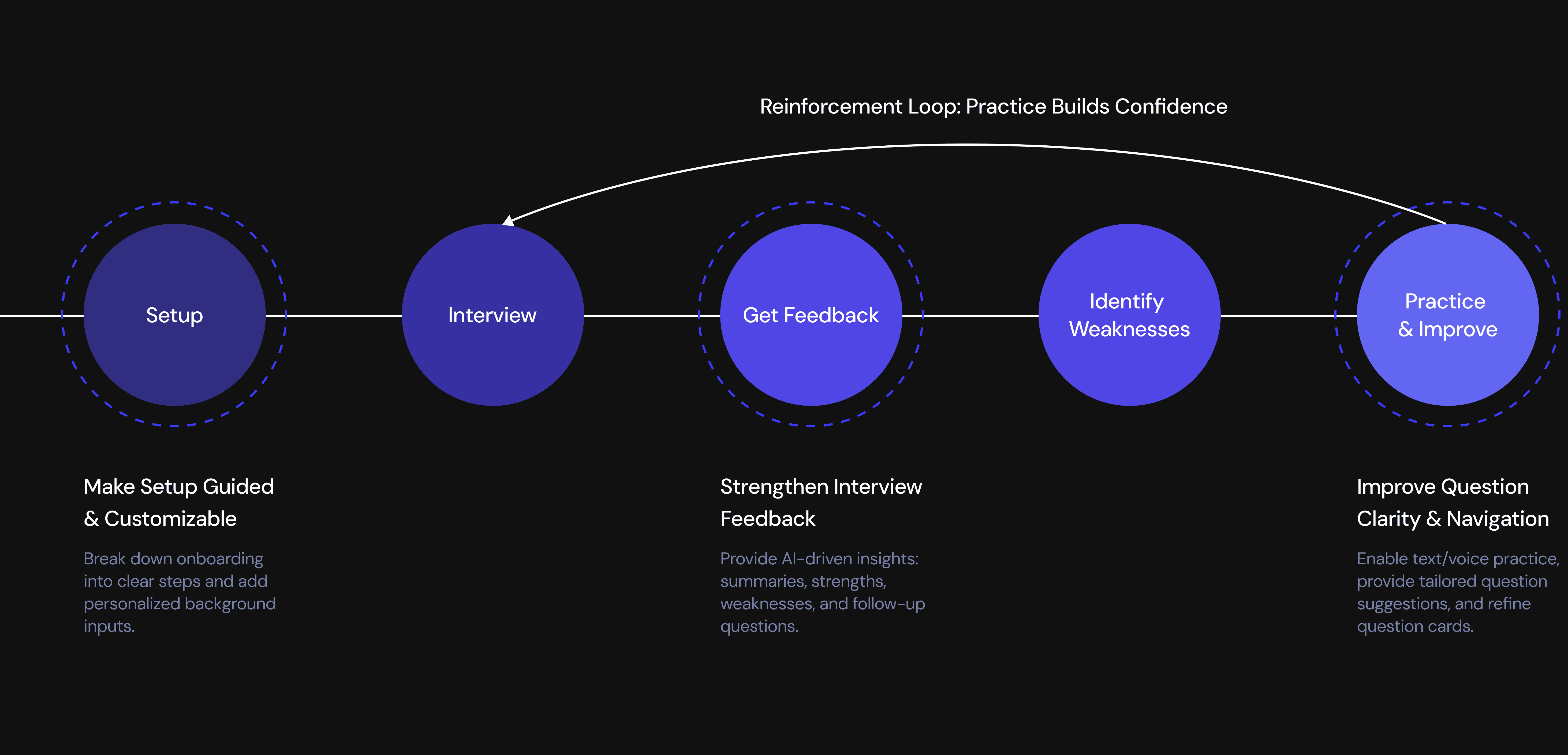
From Practice to Performance
Actionable Performance Insights
Immediate feedback builds awareness.
Interview Progress & Insights Hub
Long-term patterns reveal growth.
AI-Assisted Practice & Question Bank
Guided practice helps close skill gaps.
Identifying Friction Across the Mock Interview Journey
High Drop-Off During Setup Step

42%
of users dropped off at the onboarding page.
Low Engagement After the Interview
of users never practiced beyond their first mock interview.
27%
retention declined from Day 7 to Day 30.
How might we design an interview experience that helps users prepare better, improve continuously, and feel more confident?

Analyze user feedback across the end-to-end user flow


Overwhelming Setup

No Post-Interview Insight

Limited Practice Options

Low Confidence of their Performance

Motivated Beginners Seeking Practical Growth

Focus 1: Setup
A Guided and Customizable Setup Experience

BEFORE
Overwhelming Single-Page Setup

All onboarding tasks (job info, resume, setup instructions) were packed into a single long page.

High cognitive load — users didn’t know where to start or what was required.

No guiding structure, no sense of progress.
Before - Learning Interface Comment

Design Process
I reorganized scattered information into a 3-step flow and added key inputs to enable more customized interview practice with less cognitive load.
During the setup flow design, I explored two structural approaches.
Single-page accordion
Option 1

Reduced cognitive load
Clear sense of progress and momentum
Stronger perceived guidance

Multi-page stepper
Option 2
Fast access for experienced users

High cognitive load for first-time users
Unclear progress and completion state
I ultimately chose a multi-stage stepper to reduce complexity, guide users through critical decisions sequentially, and improve the quality of inputs that power personalized interview feedback.
AFTER
Guided 3-Step Onboarding

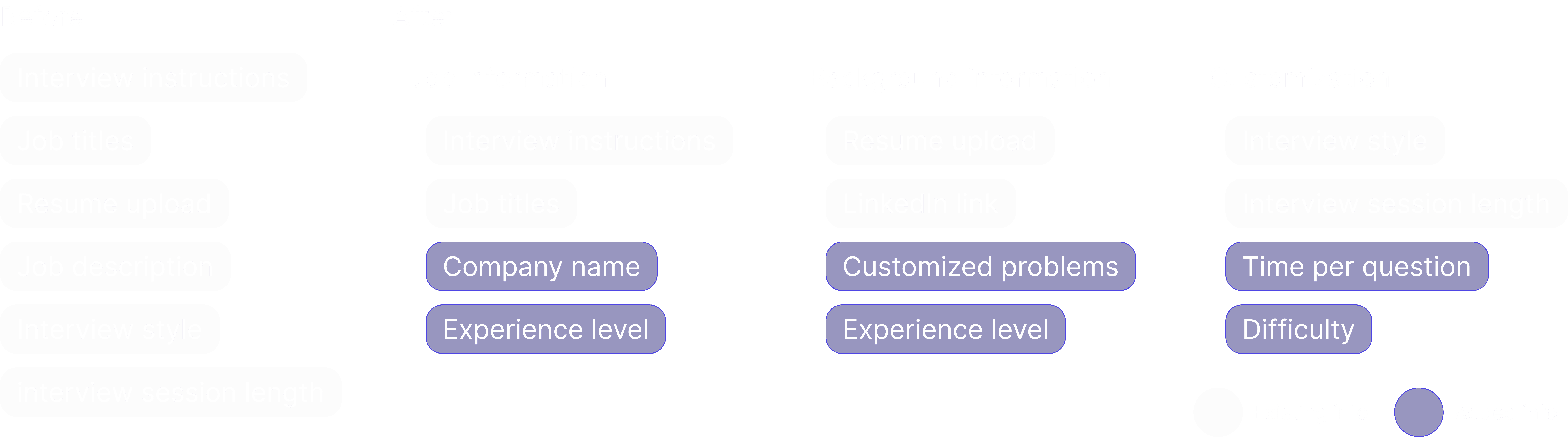
Introduced a 3-step stepper to Breaks information into focused chunks
Added a Background Questionnaire to capture deeper context.
Introduced customizable interview settings for a tailored experience.
To ensure users could evaluate their understanding and reinforce key concepts, I designed a Test-Out section that appears after each course.


Focus 2: Get Feedback
A Centralized Space to Review, Reflect, and Improve

I designed a centralized space to help users review results, reflect on performance, and improve over time.
The system consists of two connected parts: Post-Interview Recap for immediate feedback, and Performance Tracking Over Time to surface patterns and guide long-term improvement.
Post-Interview Recap
BEFORE
There is no no place to review results or track improvement.

Lack of interview record to review after interview

The system offered no strengths/weaknesses insights of the performance

No learning feedback or recommendations help user improve their interviews

Before - Learning Interface Comment

Design Process
We introduced Interview Recap.
The interview experience ends at completion, breaking the feedback → reflection → improvement loop.


Design Exploration: Where Should the Interview Recap Live?


Design Exploration: How should we present the interview recap?
Sidebar to Select Questions

Top Dropdown Question Selector

AFTER
Comprehensive Interview Record
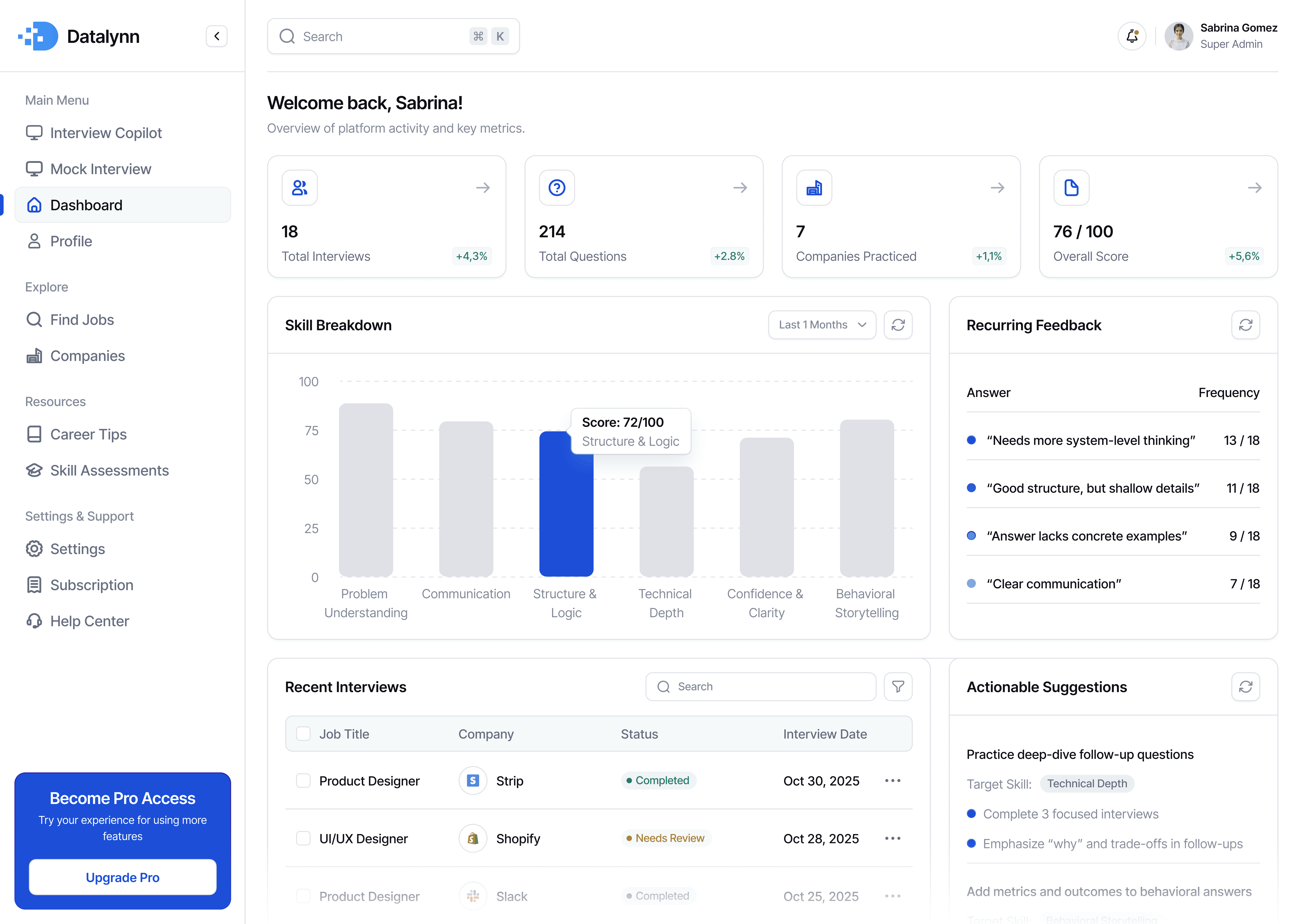
The Interview History Dashboard
allows user to revisit all past interviews.
The AI-Powered Q&A Analysis provides detailed insights for each question
Performance Feedback Dashboard
While users could review individual mock interviews, they struggled to see patterns across sessions or understand what to improve next. Interview prep isn’t about fixing one answer—it’s about recognizing recurring strengths and weaknesses over time. To address this, I designed a Performance Feedback Dashboard that synthesizes interview data across sessions and highlights actionable areas for improvement.
BEFORE
No structured feedback to understand performance over time

Users had no clear record of past interviews to review or compare progress over time.

Feedback lacked context, leaving users unsure why they received certain scores.

There were no actionable recommendations to help users improve future interviews.
Before - Learning Interface Comment

Design Process
Connecting User Questions to Product Features

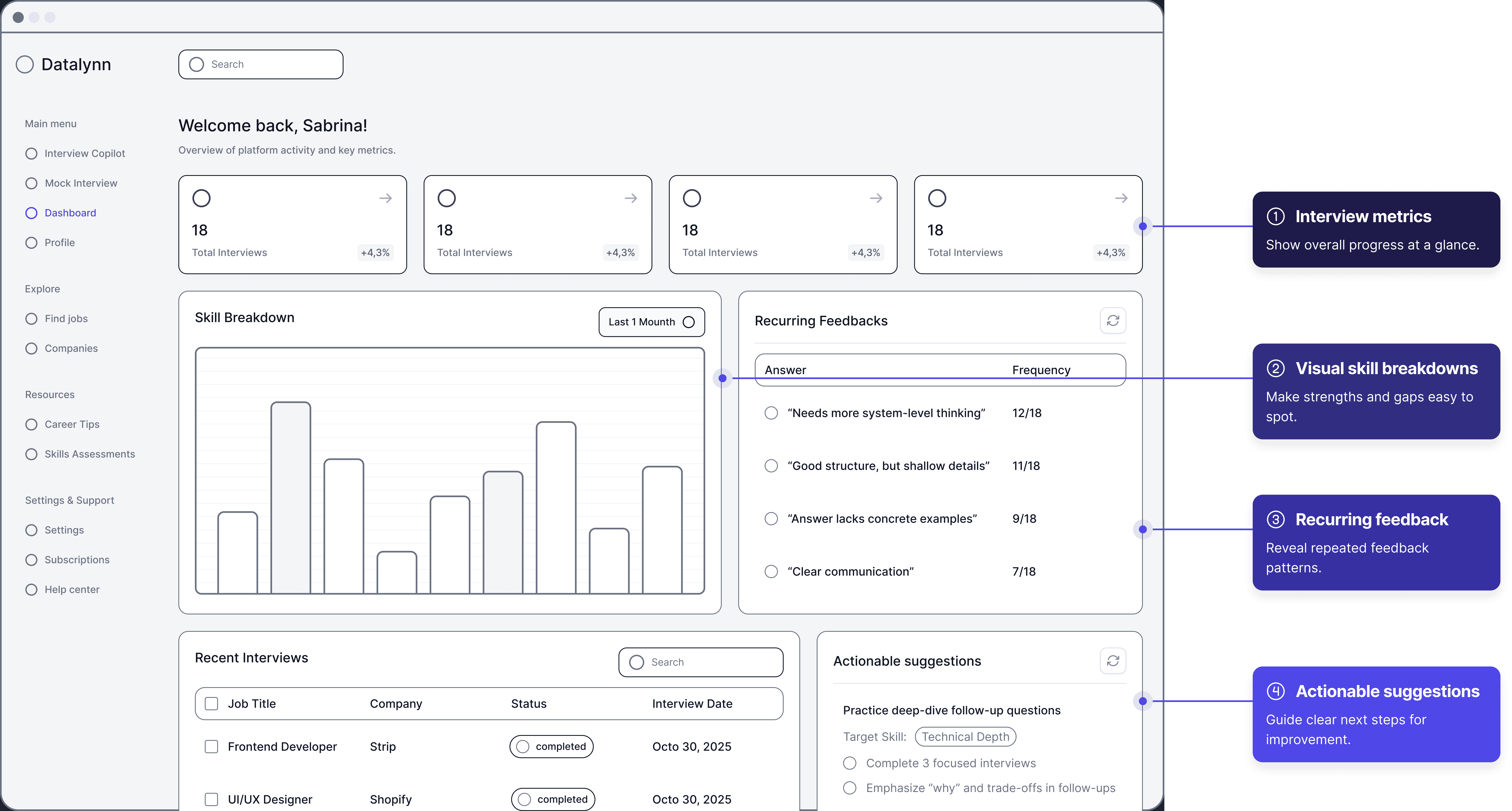
Design Exploration: Interview metrics
Option 1 - KPI Cards

Fast to scan
Low cognitive load
Sets context without overwhelming
Limited detail
Option 2 - Trend Charts

Shows progress over time clearly
More analytical
Too heavy for first glance
Requires interpretation
I chose KPI cards because they let users quickly understand overall progress at a glance without adding cognitive load or distracting from deeper analysis below.
Design Exploration: Skill Breakdown Visualization
Option 1 - Bar Chart

High clarity and readability
Easy comparison across skills
Scales well with data changes
Less visually expressive
Option 2 - Radar Chart

Holistic visual snapshot
Harder to compare precise values
Increased cognitive load
Poor scalability
I ultimately chose a bar chart because it offers clearer comparisons, scales better, and more directly supports actionable decision-making.
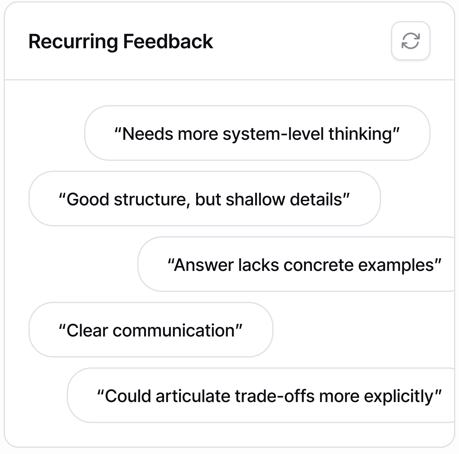
Design Exploration: Recurring Feedback
Option 1 - Frequency List

Highlights patterns clearly
Easy to scan
Low emotional load
Lacks context per instance
Option 2 - Tag Cloud
Visually expressive
Imprecise
Hard to act on
I chose a frequency-based list to help users recognize systemic issues without re-reading every comment.
Design Exploration: Actionable Suggestions
Option 1 - Checklist with Target Skill
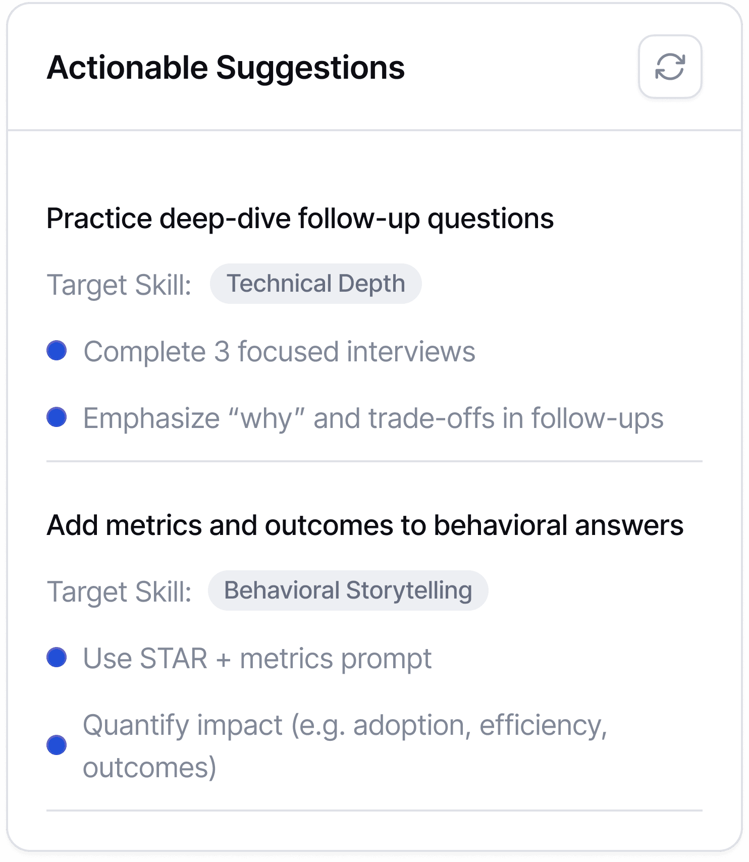
Clear next steps
Encourages action
Easy to revisit
Less personalized than conversational guidance
Option 2 - AI Coach Chat
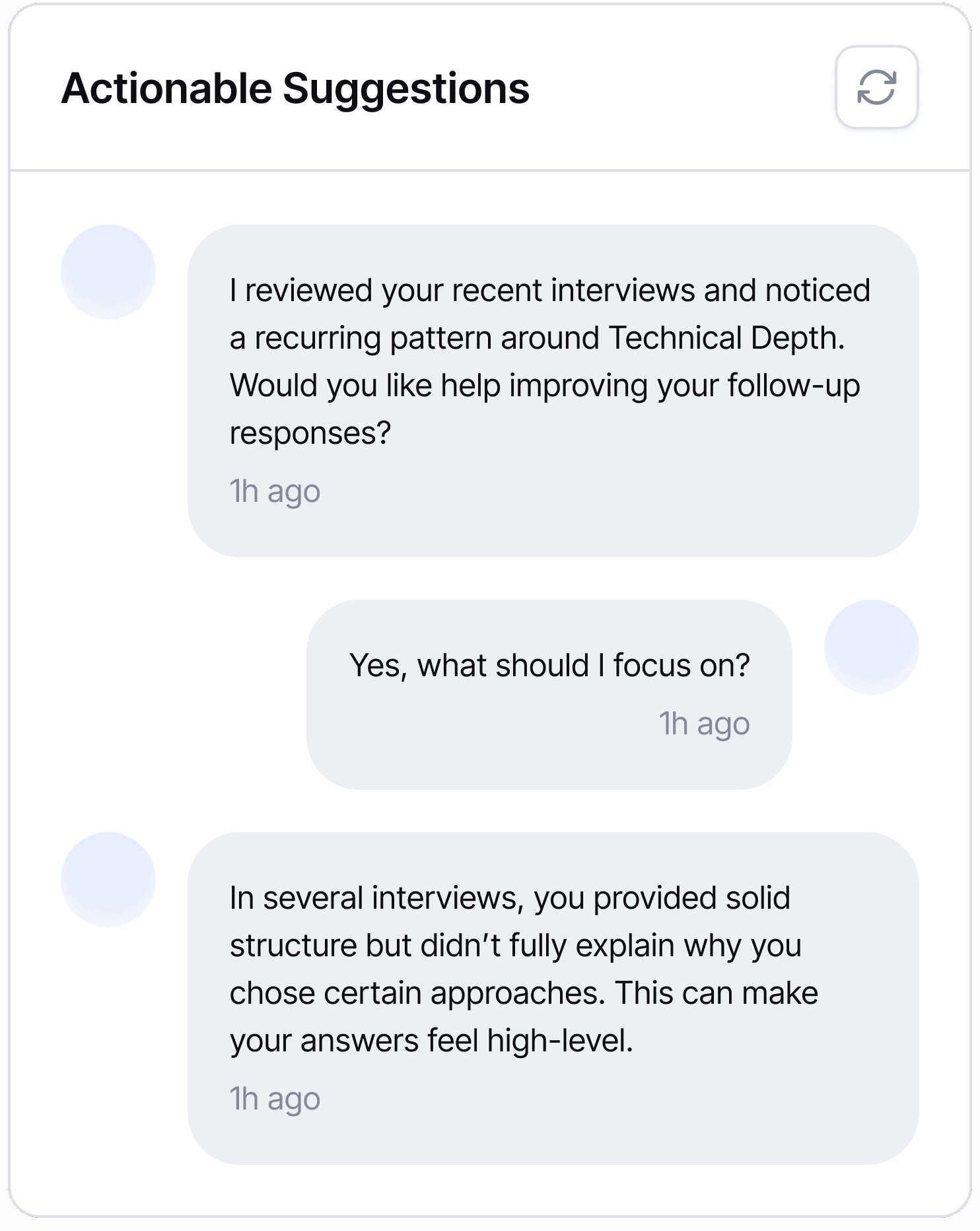
Feels personalized and supportive
Can adapt guidance based on user responses
Good for exploration and deeper understanding
Harder to scan quickly
Users may not know what to ask next
I chose the checklist because it delivers clear, actionable guidance when users have low cognitive energy, while AI chat remains better for optional, deeper coaching.
AFTER
Actionable Performance Feedback Dashboard

Clear Skill Insights — See strengths and gaps at a glance.
Pattern-Based Feedback — Identify recurring strengths and issues.
Actionable Next Steps — Get focused recommendations to improve.
Focus 3: Practice & Improve
Practice and Improve with Feedback

BEFORE
Limited Practice Options

Users could not practice questions, only read them passively.

Users had no answer analysis, so they couldn't gauge performance.

Question cards were hard to skim, with unclear labels and structure.
Before - Learning Interface Comment

Design Process
Designing the Question Card for Fast Problem Identification
When browsing interview practice questions, users struggled to quickly determine whether a question matched their current skill level.
I designed the question card using layered labels to help users quickly identify which problems a question solves, reducing decision friction and supporting targeted practice.

AFTER
A Better Question Bank for Practice and Feedback
Question cards are clearly labeled and filterable, making browsing easier.
Practice mode supports audio and text, enabling flexible, anytime practice.
AI provides answer analysis with strengths, weaknesses, and tips, giving actionable feedback.
Define the guiding principle
Icons

Typography

Colors

Components


© Jinlan Huang 2026